Mobile Digital Banking
Industry: FinTech
Country: USA
Description
Higher education is essential but also incredibly expensive. Though there are literally thousands of different courses and programs out there for students to explore, cost and logistics continue to hinder their ability to access them.
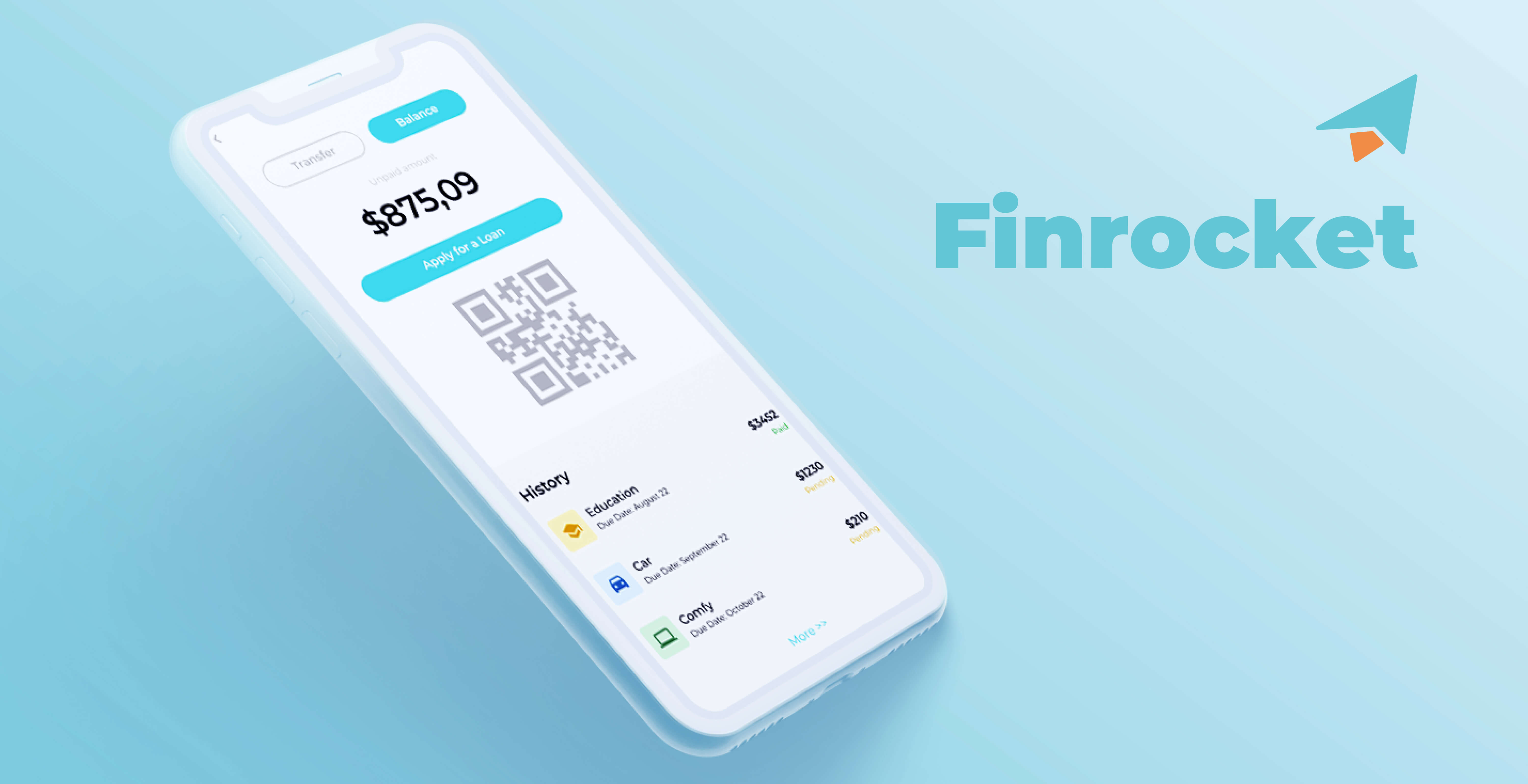
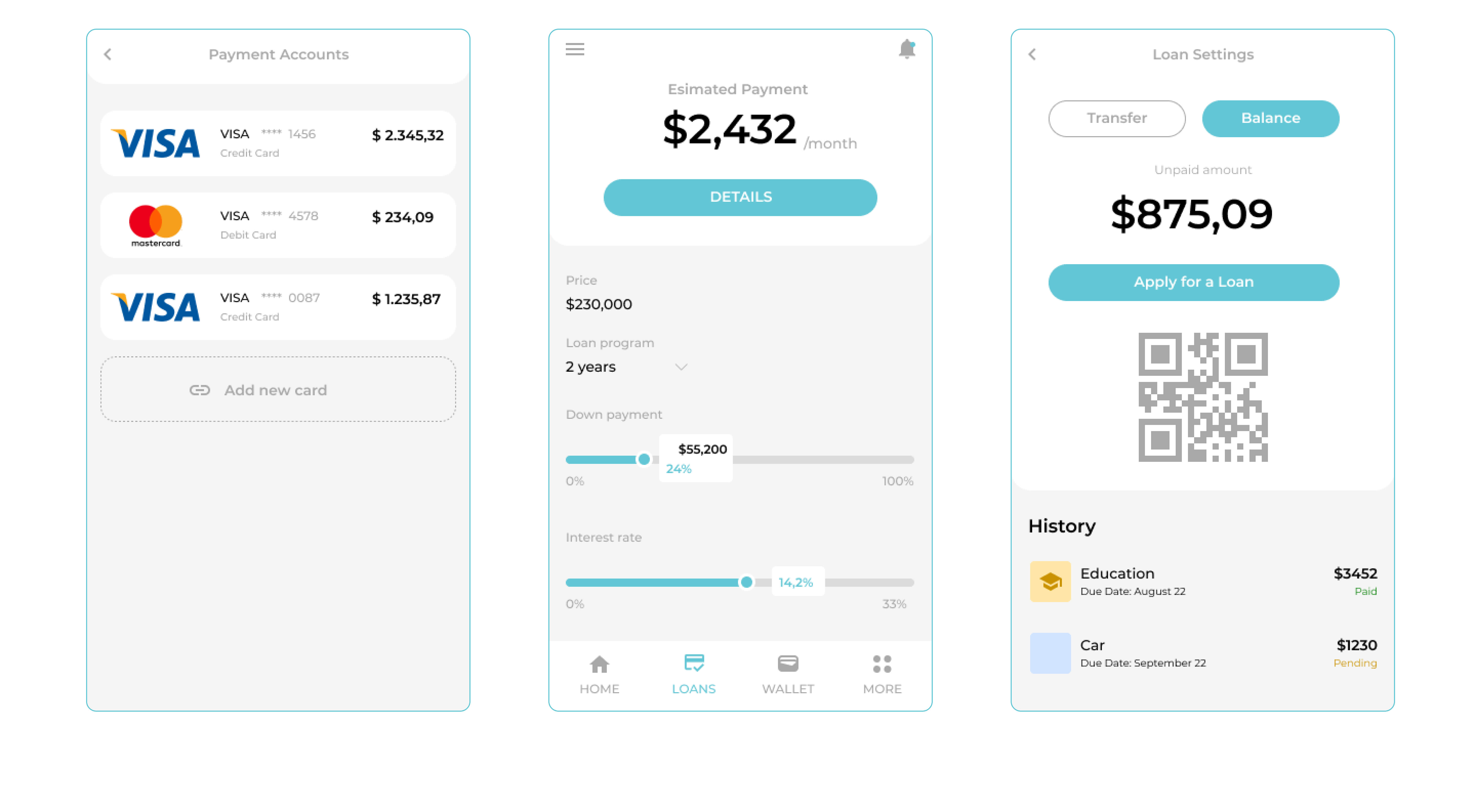
That’s where Finrocket comes in. Finrocket is a mobile platform that allows students to track and control their financial statements. The app's primary customer base consists of students looking to find loans for their online or offline education.
As a concept, Finrocket was undoubtedly something with a lot of possibilities. However, it was integral that the UI / UX be designed to keep things simple and fast, so already-busy students could find the information they needed in just a few swipes.
Client Goals
From Inventorsoft's side, we helped with the UI/ UX part. In Finrocket’s case, the client wanted an app built entirely from scratch. But they were looking for more than just a way to apply for and track student loans. They also wanted them to be able to control all of their financial expenses at the same time. Moreover, they wanted options for users to apply for more money if needed – all within a simple, clear, and clean interface.
Challenges
In order to deliver the best possible user experience, we had to spend quite a bit of time analyzing the specific needs of students and other potential users. Since the Finrocket app was going to take a broader approach to financial management than other such tools, it was vital that we understand precisely how the customers would utilize the app and – more importantly – how they wouldn’t.
Eventually, all of this information would need to go into developing a bespoke customer journey map. Since the project would need to be created from scratch, it was essential that we boil down all of this acquired data into the most usable, valuable parts.
We also had to uncover the major pain points the app’s potential users experienced when interfacing with similar apps. As it turns out, they had problems getting all the necessary information on time. Moreover, they felt it was challenging to manage their various education expenses, especially when it came to issuing and receiving loans.
Process
To achieve the best result and goals of the product, we decided to utilize the Double Diamond approach. This is a structured design strategy that tackles challenges through four phases. They are “Discover / Research,” which provides insight into the problem, “Define / Synthesis,” which tells us which areas to focus on, “Ideate,” “Prototyping,” and “Delivery.” Once our design roadmap was correctly outlined, we began collaborating with the development team. This broke down as follows:
- Discover: We started by aligning the project vision. As previously discussed, we researched the customer’s unique problems as well as common problems dominating the niche. From there, we identified any specific business opportunities that were present.
- Define: At this point, we began to generate and score different proposed ideas to define the best possible approach. From there, we could mock up and test each proposition to get a more tactile feel for how they might look.
- Ideate: This stage was where we began to hypothesize on different user flows, including how they might implement later on. This included conducting multiple interviews better to understand user goals, pain points, and needs. Again, we used this information to generate new propositions and score them based on established internal criteria.
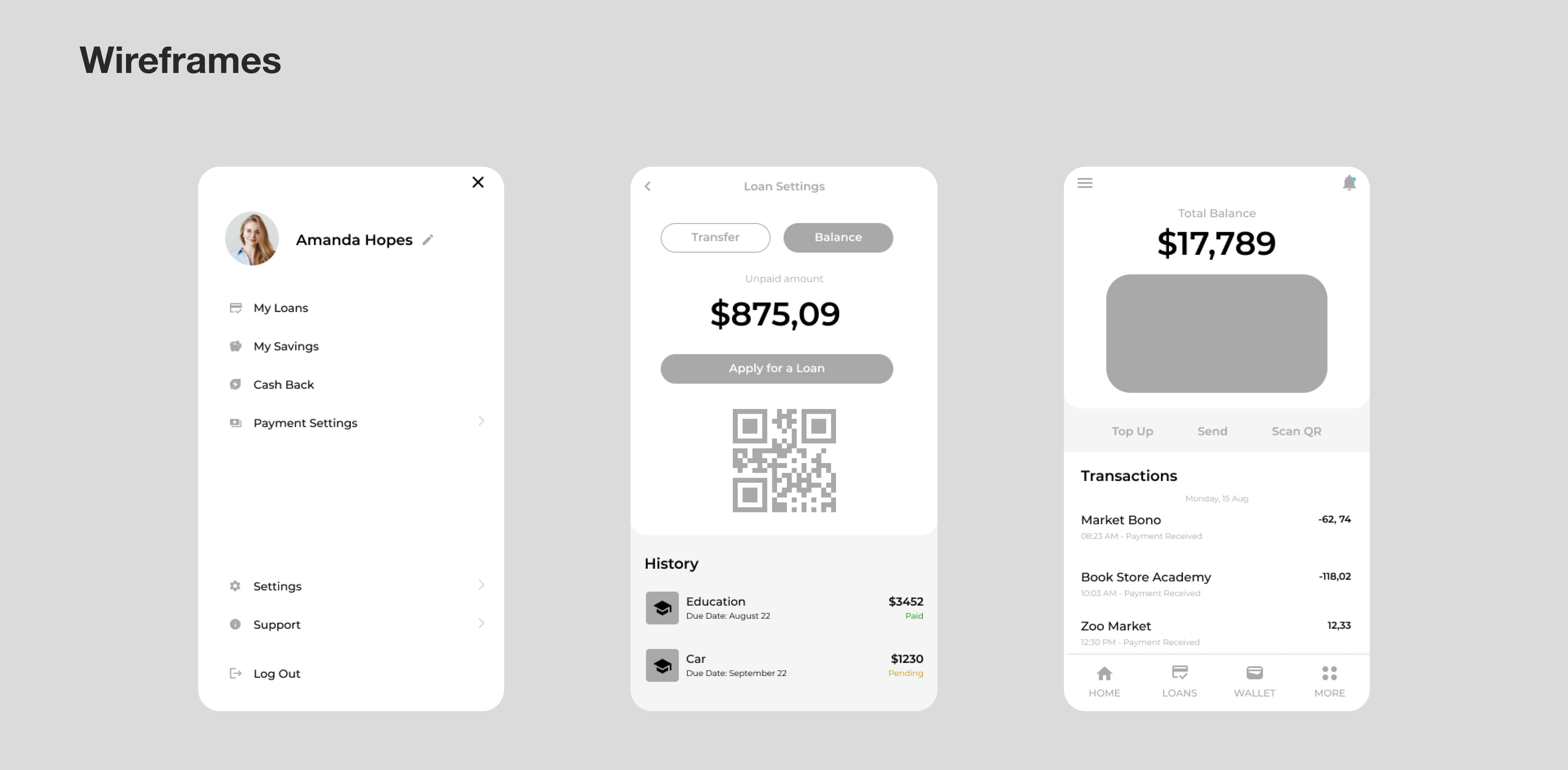
- Prototype: The prototyping phase consisted of generating UX / UI wireframes so that we could adequately mock-up and test various propositions. This allowed us to visualize better how each would meet the customer’s needs.
- Delivery: At this point, we were able to deliver a roadmap to the client confidently. From there, we were able to launch the product via various test releases.
Result
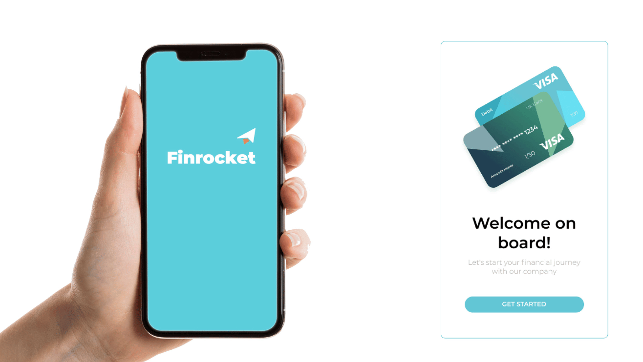
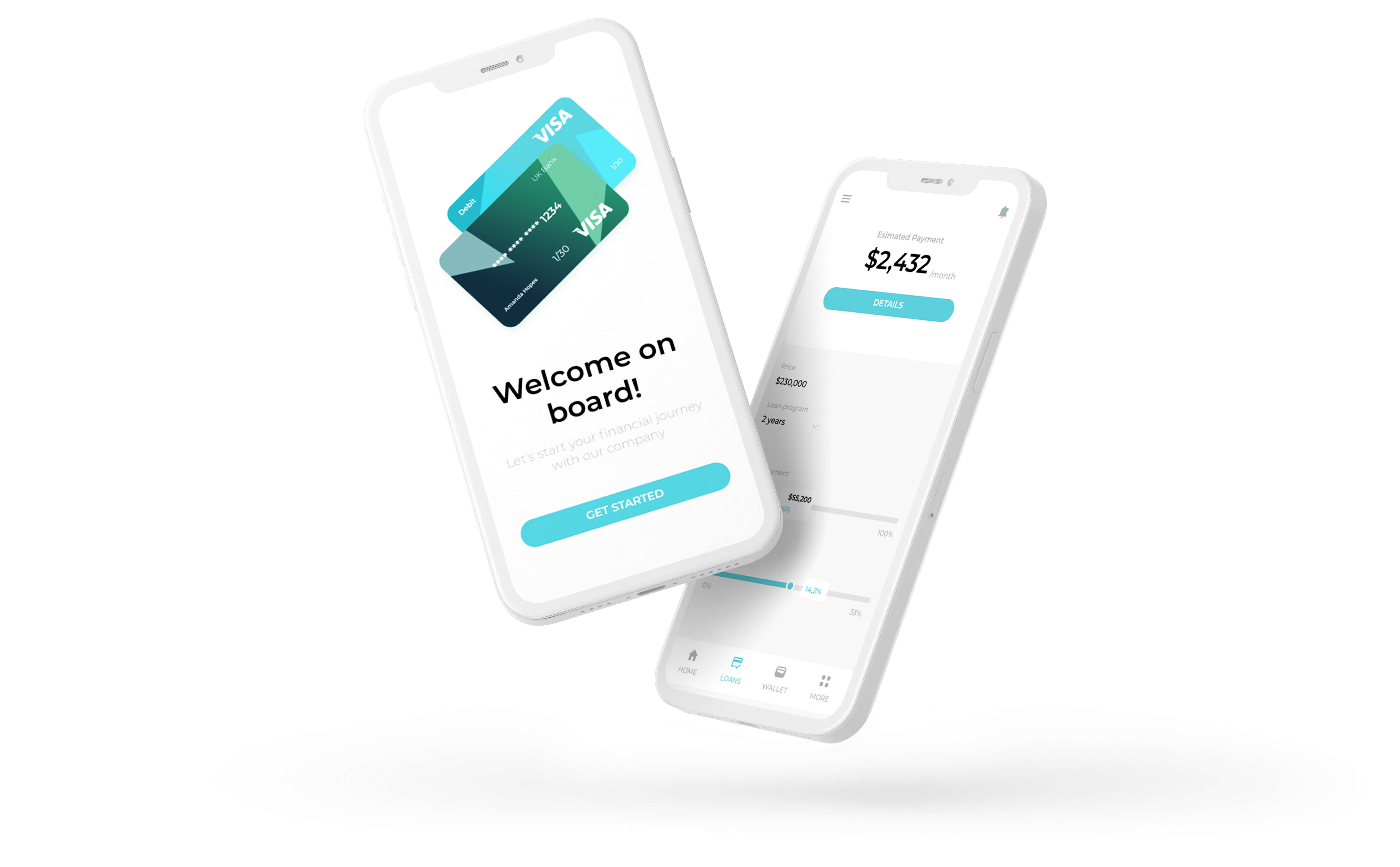
Ultimately, we were able to create a mobile platform that satisfied the client’s requirements and overcame the majority of the associate user challenges. The final product allows users to track and control their financial expenses in a simple, intuitive way. It also allows them to apply for, receive, and track additional funds if necessary. At the same time, we managed to keep the overall navigation and UI very simple. Users don’t need to go through multi-stage verifications or fill out confusing forms. Instead, the app does the bulk of the work on their behalf.
Details
Timeline
January 2022 - June 2022
Team
2 UI / UX designers
Typography
Font Family - Montserrat
Colors
Used Technologies
Figma