Property marketplace
Product: Web applicationScope of Work: Back-End, Front-EndCountry: CyprusIndustry: Real Estate
Project Description
Technology and real estate have married in a variety of different ways over the past few decades. One of the most recent, and arguably one of the most innovative, examples is Hizzle. Founded in Cyprus, Hizzle is one of the very first live ‘bid & ask’ property marketplaces. This unique business model clearly has a lot of benefits over more traditional methods and could revolutionize the entire sector.
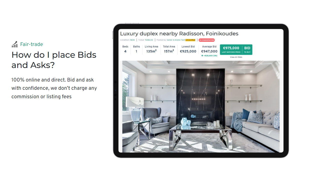
It works like this: Buyers place Bids on properties while Sells place asks, or “requests.” Like a dating app, the pairs are “matched” when their information aligns. From there, Hizzle allows them to talk, organize a viewing, and do anything else required to close the transaction. The Inventorsoft team immediately agreed to help, because understood that Hizzle had a lot of potential. However, the site had some very outdated functionality.
Hizzle had already proven itself as a concept, but it was up to the Inventorsoft team to ensure optimal functionality. We wanted to support them in building a platform where home seekers and home sellers could truly thrive, so we’re very happy they came to us for help.
Client Goals
While Hizzle’s idea was revolutionary, they came to us with a site that was suffering from a severe lack of functionality. As the site took on more and more users, they needed to expand the platform’s functions to accommodate new buyers, sellers, and renters. The goal, as with any site, is to create a positive user experience and maintain maximum retention. Most importantly, the interface had to be smooth and clean, given the high-value nature of the products.

Our Solutions
We immediately assigned one full-stack developer to the Hizzle platform. It was vital that we have someone who could build both the front end and back end of the site in order to optimize experiences for the buyers, sellers, and the Hizzle staff.
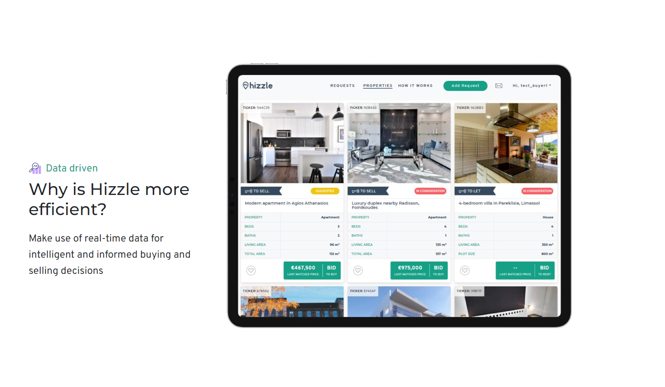
The first part of the website we tackled was the buyer side. This meant designing an interface that showed both a map view, a preview of promoted properties, and a simple filter section where users could select the region, area, minimum and maximum price, and sort their results. We designed this to be virtually the same for both the renting and buying sections, though we separated them to make things easier for users.
The functionality of the renting section is also very similar, consisting of a map view, promoted properties, and a filter section. At the touch of a few buttons, prospective renters could view available apartments, add geo-location of buildings, filter by the number of rooms, and choose the type of premises (hotel, house, office, shop, apartment, etc).
Because selling a property is much more involved, we designed a completely different functionality for that process. While filtering is essentially the same as for buying, sellers and renters have access to a different suite of cautions. Of course, we made sure to include all the important user management features, including registration, login, edit user, and two-factor authentication.

Results
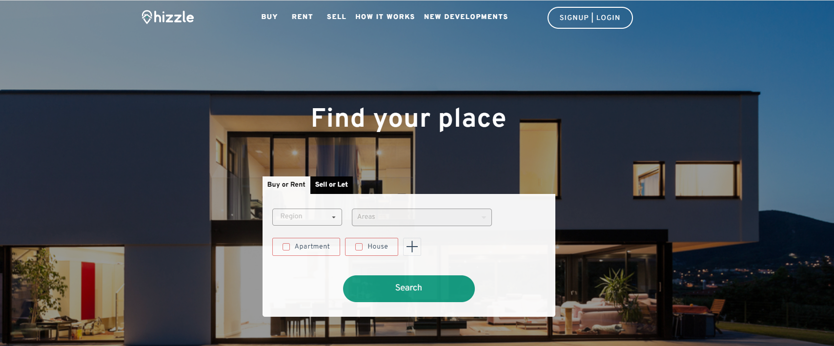
The Hizzle platform has been fully operational for four years now. Visitors are greeted with a landing page and a widget that allows them to start buying, renting, selling, or letting immediately. Most users report that the interface is incredibly easy to use and appreciate the integration of instructions and supplemental information alongside the various search functions.
Project Details
From the client side
Scrum
Web
1 Full Stack
Amazon
PostgreSQL
2021 - 2022
Angular, RxJS, Node.js